I started risu.tech because I wanted somewhere to write about the parts of software work that usually disappear: the strange behavior, the failed idea, the small experiment that finally explained what was happening.
Then the site became a software project of its own.
Some of that work was necessary. I needed stable links, readable articles, local images and data, feeds, and a way to change the design without rewriting every page. Some of it was me building a system before I had enough writing to prove that the system helped. Telling those two kinds of work apart has been the hardest part of building the site.
This is the story of what survived.
What I was actually trying to make
I wanted a site where:
I could explain a technical problem without stripping away the evidence;
the source remained readable without the website;
unfinished work could be honest about being unfinished;
navigation described what was really available;
design helped someone read instead of asking to be admired.
That last requirement took the longest to understand.
Keep an article understandable on disk
Each article lives in its own directory. The prose is Markdown, publication details are TOML, and figures or data sit beside them. I can open that directory years from now and understand what belongs together without starting the application.
The application still needs a stricter shape than a folder full of files. A small compiler reads those files, checks their relationships, and produces one Article value for the rest of the site.
pub struct SourceDocument {
    pub metadata: SourceMetadata,
    pub body: SourceBody,
    pub resources: SourceResources,
}

pub struct Article {
    pub id: ArticleId,
    pub metadata: ArticleMetadata,
    pub body: Document,
    pub resources: ResourceSet,
    pub relationships: ArticleRelationships,
}
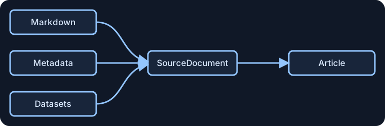
That compilation step gives me one place to catch a missing asset, a broken reference, or an invalid chart. After it succeeds, the article page, writing index, RSS and Atom feeds, and sitemap all work from the same record.
| What I edit | What the compiler produces | Where it appears |
|---|---|---|
| Markdown | Paragraphs, code, callouts, and figures | Article page |
| TOML | Title, dates, topics, and resource definitions | Page header, feeds, and search |
| Images and datasets | Checked local resources | Figures, charts, and downloads |
| Links between articles | Series order and references | Navigation and related writing |
Earlier versions treated the body as a finished chunk of HTML. That was easy until I wanted a figure, chart, or callout to behave like a real part of the page. Compiling the body into typed blocks let the article say what something is while the design decides how to present it.
Derive the other pages from the article
Once the article has one checked representation, I do not need separate rules for the page, the index, and the feeds.
flowchart LR
    Files[Markdown, metadata, and resources] --> Compiler[Compiler]
    Compiler --> Article[Checked article]
    Article --> Page[Article page]
    Article --> Index[Writing index]
    Article --> Feeds[RSS and Atom]
    Article --> Sitemap[Sitemap]
This sounds like an architectural preference, but it solved ordinary mistakes. A draft cannot quietly appear in a feed while remaining absent from the writing page. A changed title does not need to be updated in three places. A missing local file fails when the content loads instead of becoming a broken image later.
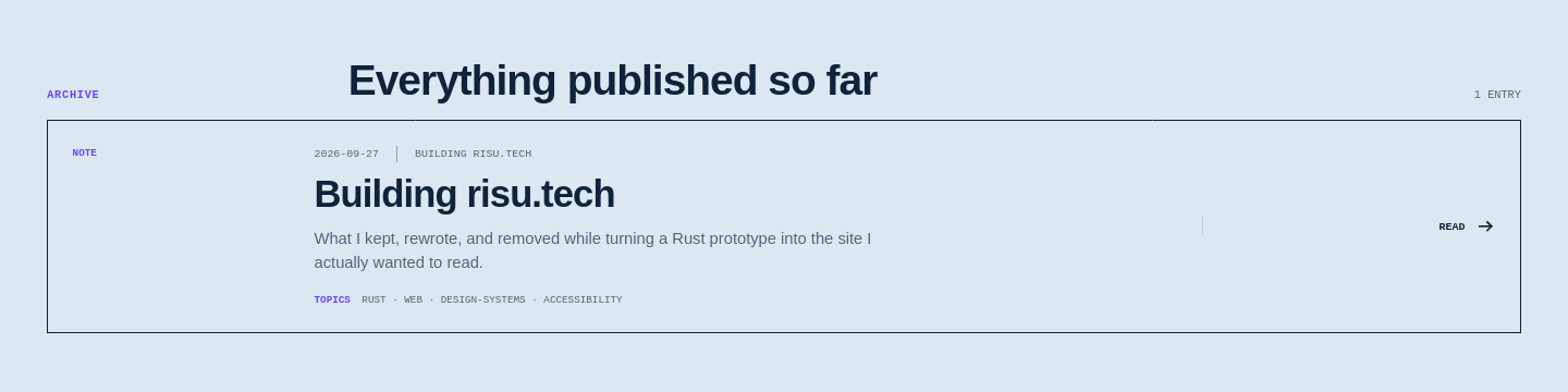
The writing archive is one visible result. The title, description, date, series, and topics shown below come from this article's record. The feeds and sitemap read that same record rather than maintaining their own copies.
Design around reading, then check the result
I made several visual studies before this version. One looked like a lab notebook, another exposed every grid line and structural rule, and a third resembled an instrument panel. The second study became the starting point because it felt closest to the work: direct, technical, and willing to show its construction.
I did not want the study to become a cage. The lasting design has two layers:
components define hierarchy, spacing, focus, and responsive behavior;
semantic tokens such as
--paper,--ink, and--actionsupply the visual character.
Light, dark, and high-readability modes change those tokens without changing the article itself.
The first contrast check found a real miss. Secondary text in light mode measured 4.46:1, just below the 4.5:1 WCAG AA threshold for normal text. Darkening --ink-soft from #526a83 to #4f667e raised it to 4.73:1. The graph shows the corrected colors and lets each mode be checked on the same scale.
Do the reading modes preserve enough contrast?
Choose a mode to compare the text colors this site uses. Normal text needs a contrast ratio of at least 4.5:1.
Loading...
6 data points
View data (6 rows)
| Role order | Role | Mode | Contrast ratio |
|---|---|---|---|
| 0 | Body copy | light | 12.61 |
| 1 | Secondary copy | light | 4.73 |
| 2 | Links | light | 4.56 |
| 3 | Action labels | light | 5.51 |
| 4 | Selected text | light | 9.94 |
| 5 | Navigation | light | 8.73 |
The reading-mode control now lives in the footer with the feeds. It is always available, but it no longer competes with the writing for attention.
Stop making the interface perform
This part took several attempts because I kept solving the wrong problem.
The first home page was so abstract that it did not say what the site was. The next version sounded like a portfolio template. Another sounded like an institution explaining its publishing platform. Each was polished in isolation and wrong for the person behind it.
The same thing happened with typography. I used large fluid headings, then placed them in narrow grid columns. Titles broke into stacks of tiny lines while half the screen sat empty. The formula was responsive; the result was not.
Charts repeated the pattern. One plotted the font-size formula, which proved only that the formula produced numbers. Another compared a bounded request with an unbounded one, which made an obvious fact look important. The chart component itself reserved narrow columns for controls and commentary, then drew a fixed-width plot inside the space that remained.
The corrections were less glamorous than the designs:
say plainly what the site contains;
let text use the space around it;
keep controls above the graph instead of squeezing prose beside it;
use a graph only when the comparison changes what I know;
remove destinations and features that do not yet have real content.
A first visit should answer “What is this?” before it explains how the site works.
Keep search proportional to the amount of writing
I built search and pagination before the site had enough articles to need either one. Showing those controls next to a single result made the page look like a demo.
The visible controls are gone for now. The useful part—the request boundary—remains. The browser asks for a query, a page, and a page size. The server returns only that slice using the small record below.
pub struct ArticleListingItem {
    pub id: ArticleId,
    pub title: String,
    pub description: String,
    pub published: Option<String>,
    pub series: Option<String>,
    pub tags: Vec<String>,
}
This keeps article bodies, private fields, and results from other pages out of the response. More importantly, it lets the interface stay simple until there is enough writing for search to help.
Let the server page exist before enhancing it
Mermaid exposed a failure I had not expected. The browser script could replace a diagram's source with an SVG before Leptos finished hydrating the server-rendered page. Leptos then found a different DOM tree from the one it expected and stopped with a hydration error.
The fix was to establish a clear handoff. Leptos now marks hydration complete and emits an event. Diagram and math enhancement waits for that signal before changing the document.
if (document.documentElement.hasAttribute("data-hydrated")) {
  connectEnhancements();
} else {
  window.addEventListener("risu:hydrated", connectEnhancements, { once: true });
}
The original diagram source remains readable before JavaScript runs. If Mermaid fails, the source stays on the page and the console records the error. Dark mode needed one more correction: Mermaid embedded a light-theme edge color in its SVG, so the stylesheet now binds those paths and arrowheads to the site's own text color.
What I would do differently
I would start with a real article much earlier. Placeholder content made it easy to reward whatever the design already did well. A long, imperfect article exposed the narrow columns, oversized type, vague labels, and ornamental controls immediately.
I would also ask a simpler question before adding a component: what becomes clearer for the reader? If I cannot answer that, the component is probably serving the system rather than the writing.
For now, I am deliberately leaving out:
a database-backed editor;
live content refresh;
a large plug-in system;
navigation for collections that do not exist yet;
search controls before the archive needs them.
None of those ideas are forbidden. They just have to earn their way back through a real piece of work.
Where the site stands
The authoring path is ordinary now: create a directory, write Markdown and TOML, put supporting files beside them, and publish. The application checks the result and uses it everywhere it needs to appear.
For a reader, I want even less of that machinery to show. The page should say what happened, show enough evidence to support it, and make the next useful thing easy to find.
The source is available on Codeberg. The site is built with Rust and Leptos, but those are implementation choices. The real test is whether the writing feels honest, specific, and worth returning to.